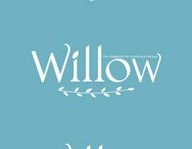
Design a Logo & Nameplate for W I L L O W Magazine (the digital mag for conscious mamas)

  • Állapot: Closed
  • Díj: $100
  • Beérkezett pályamű: 5
  • Nyertes: primavaradin07

A verseny összegzése

W I L L O W - the magazine for conscious mamas -

DESIGN BRIEF for LOGO & NAMEPLATE


To design a nameplate & icon/logo for our digital magazine.
We have the main ideas, just need you to execute them!

About WILLOW Magazine:
- A digital magazine for pregnant mothers, new mothers and beyond.
- Alternative, holistic, spiritual audience.
- Written for mothers, by mothers
- Share expert opinion, personal stories, and how-to’s with an emphasis on giving back to charities that support mother & baby causes.
- Topics include birthing, health & nutrition, parenting, art & craft, poetry, recipes, exercise regimes and more
- As it’s digital the magazine will include audio and video files, and links.
- Please see our mission statement in the attached design brief document.

Audience:
- target niche is women age 25-40
-“alternative” crew (more spiritual/newage than mainstream)
- interested in natural pregnancy & birthing, peaceful parenting, holistic health, alternative medicine, organic food, yoga, meditation, hands-on art & craft.

INSTRUCTIONS:
Please read carefully the document titled "WILLOW Design Brief Logo / Nameplates.pdf".
Here we have detailed instructions, with images to show you examples in the text. You can find each of these files attached separately.

NAME PLATE INSTRUCTIONS:

Want 4 versions:
1. just the magazine title “Willow”
2. “Willow” and tagline
3. “Willow” and willow branch underline
4. “Willow”, tagline and willow branch underline

Name plate:

Willow

- design like the attachment “Willow Logo Vector Example”
- take this font and alter slightly, making it unique. Slightly more flowy, (not cursive).


Tag Line:

the magazine for conscious mamas

- experiment with tagline in serif, and then another example using the sans serif.
- tagline to fit neatly on top of the final two letters of Willow (“ow”). (may need to increase spacing between letters of “Willow” to make this fit nicely).


Willow Branch Underline:

- something similar to the attachment “Willow Branch Underline.jpg”
- must have handrawn look
- serves purpose of emphasising the natural beauty of the Willow tree
- artistic, yet simple/modern
- Do not make it as wide as the nameplate (for example, it may start from the “i” and finish at end of the “o”)


LOGO INSTRUCTIONS:

- simple
- can use up to 3 colours, but must look good in black & white
- design in black and white. Send to us in formats that we can change the colours in.
- Take the capital “W” and place inside a wreath made from a willow branch. Similar to attachment “Willow Logo Idea”.
- We want the wreath to look more like a wreath than a circle with some leaves on it.
- Try a double layer wreath (2 branch circles rather than one). Please see attachment “Willow Logo Sketch” for example:


Design Requirements for Logo & Nameplate:

- distinctive
- recognisable
- appropriate for audience
- usable in # of places, not just front cover (ie. letterhead, signage, advertising)
- not too many details, must have enough weight to stand out (as nameplate is often overprinted with photos/images)
- recognisable when partially obscured (may have model heads over it)
- no drop shadow and outlines of the letters (gimmicks)
- stands out when use VALUE (lightness/tone) rather than Colour Contrast
- needs to look good when printed in any colour
- vectorised
- need all formats (.png, .jpeg, .ai etc)
- Need on white background, and transparent background.

Please ask any questions.
Feel free to use your creative flair within the guidelines.

Thank you!

Ajánlott készségek

Munkaadói értékelés

“Ana went above and beyond in her delivery. Her work stood out as top class against all the other entries. Great communication, very helpful, pleasure to work with.”

Profilkép mamafifi, Australia.

Nyilvános pontosítófelület

  • Mubeen786
    Mubeen786
    • 8 év telt el

    Do you want any changes ?

    • 8 év telt el
  • Mubeen786
    Mubeen786
    • 8 év telt el

    Please check and give feedback for my entries .. Thankz.

    • 8 év telt el
  • Mubeen786
    Mubeen786
    • 8 év telt el

    Please check #27 . Thankz

    • 8 év telt el
  • mamafifi
    A verseny kiírója:
    • 8 év telt el

    To primavaradin,

    • 8 év telt el
    1. mamafifi
      A verseny kiírója:
      • 8 év telt el

      Hey! LOVING your recent entry!
      Would like to see it with the olive colour background you used in a previous entry.
      Based on your knowledge, do you think the WILLOW font has been altered enough from the original so that it will not break copyright?

      Q - what files do your clients normally ask their logo/nameplate delivered in?

      The logo will be used in social media profile pictures. Could you show me a couple versions of the logo that would make for a good profile picture? (I love the design. Now I'm referring to colours etc. Perhaps you could put it on a white background with green symbol? or can you make it a profile picture with the background green and the linework white still? What are your thoughts on this?

      Thank you! Appreciate your efforts!

      Oh, also. I have an enquiry re: future work. Would you take on contracting projects of creating fact cards, coverphotos (for facebook), instagram memos etc etc? For social media. (given the design brief of course!)

      Thanks again!
      -Fi

      • 8 év telt el
    2. mamafifi
      A verseny kiírója:
      • 8 év telt el

      Would really like to know your thoughts on the font re: copyright. What would you suggest to change about it, yet keeping it as close to as possible?

      • 8 év telt el
  • mamafifi
    A verseny kiírója:
    • 8 év telt el

    To primavaradin07

    • 8 év telt el
    1. mamafifi
      A verseny kiírója:
      • 8 év telt el

      #22. Logo. Could you try 2 rounds of willow branch instead of 3? And rotate the wreath 90 degrees to the right (so it looks less egg shaped). Can you make the wreath look a little more natural and a little less like barbed wire? Thank you for your efforts!

      • 8 év telt el
    2. mamafifi
      A verseny kiírója:
      • 8 év telt el

      #22. Nameshield. The cursive writing looks nice but I've tried it on the front of a magazine and it appears too messy....does not catch your eye as it's too detailed. I'd like to see it with a traditional font now. Like the font in the attached image called "Willow Branch Underline". Please put a branch like this one, but with your style of drawing to match the icon. I'd like to see a version of just the Nameshield (Willow), then one with the branch underline, then one with the Name shield and the tag line, then one of all 3 elements together (branch underline, Nameshield and tag line). Also would like to see it all in white on the turquoise background. Thank you!

      • 8 év telt el
  • mamafifi
    A verseny kiírója:
    • 8 év telt el

    Arkin15,

    • 8 év telt el
    1. mamafifi
      A verseny kiírója:
      • 8 év telt el

      Thank you!

      • 8 év telt el
    2. arkin15
      arkin15
      • 8 év telt el

      I'll do it. Please wait for my next entry. Thank you.

      • 8 év telt el
  • mamafifi
    A verseny kiírója:
    • 8 év telt el

    To Arkin15,

    • 8 év telt el
    1. mamafifi
      A verseny kiírója:
      • 8 év telt el

      Hi there, thanks for your entry. It’s quite creative, however I do not want the pregnant woman there. This is because the word “Willow” needs to be very simple. It’s the nameplate / name shield of the magazine. I’d like to see you sharpen up the lines of Willow, add the hand drawn willow branch underline, and fit the tagline “the magazine for conscious mamas above the “ow”. Any questions? Thank you, and have a great day!

      • 8 év telt el
    2. arkin15
      arkin15
      • 8 év telt el

      Hello there I submitted my new entry.

      • 8 év telt el
  • mamafifi
    A verseny kiírója:
    • 8 év telt el

    Hi Blueba and Ahadalidiz, thanks for your entries. Perhaps I was not clear enough in the design brief. I want the WILLOW name shield to look just like the file I uploaded called "Willow Logo Vector Example". The only difference I want is for you to adjust the look of it slightly so as to not infringe upon copyright (as it was designed by someone else). Try putting more space in between each letter. Also, I want the Nameplate (WILLOW) to have the handrawn willow branch underneath it, similiar to image "Willow Branch Underline." however, please make the branch not as wide as the Nameshield. All these instructions are in the design brief. And then for the logo/icon, I want a willow branch wreath, with the same "W" as Willow. Please ask me questions for further clarification. Thanks again, and have a great day!

    • 8 év telt el

További hozzászólások

Így vágjon bele a versenyekbe

  • Tegye közzé a versenyét

    Indítson egy versenyt! Gyors és könnyű

  • Pályaművek százai várják

    Kapjon akár több száz pályaművet A világ minden szegletéből

  • Díjazza a legjobb pályázatot

    Díjazza a legjobb pályázatot Töltse le a fájlokat - csak egy kattintás!

Projekt közzététele vagy csatlakozzon hozzánk még ma!