Szabadúszó:
mofodesign

2
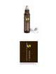
Hello:) I really like the amber glass color and the looks you presented. I really think it would look best if you printed on a clear label to show off the amber bottle. Also, light text reversed out o n dark is a really cool look for your type of design. I think you are hearing this from other designers, but the size of the label is a bit limiting in space. Fonts should really not be less than 5 or 6pt for legibility but even that is quite tiny. I think this will work fine. The logo and text must be sideways so that the customer is able to read it when printed. I would be happy to show you other fonts or refine the design your feedback even after the contest is over. I hope you like it:) Marija